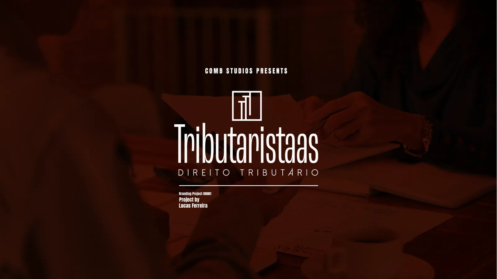
Tributaristaas
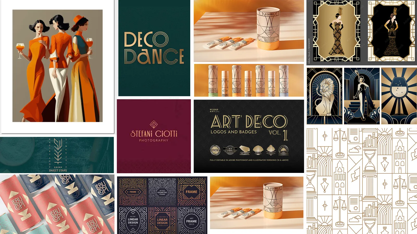
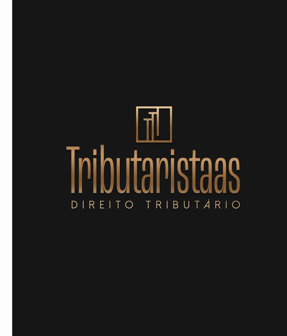
Art Deco ruled the corporate buildings of the 1930s, home to the big accounting and law firms. A style that grew up in male-dominated rooms here stands for women running their own firms: simple, sophisticated shapes, delicacy and subtlety without giving up strength, objectivity and clarity.
- Client
- Tributaristaas · tax law
- Year
- 2025
- Deliverables
-
- Art Deco concept
- Symbol and construction
- Logotype and variations
- Typography and palette
- Stationery, signage and screens
The brand
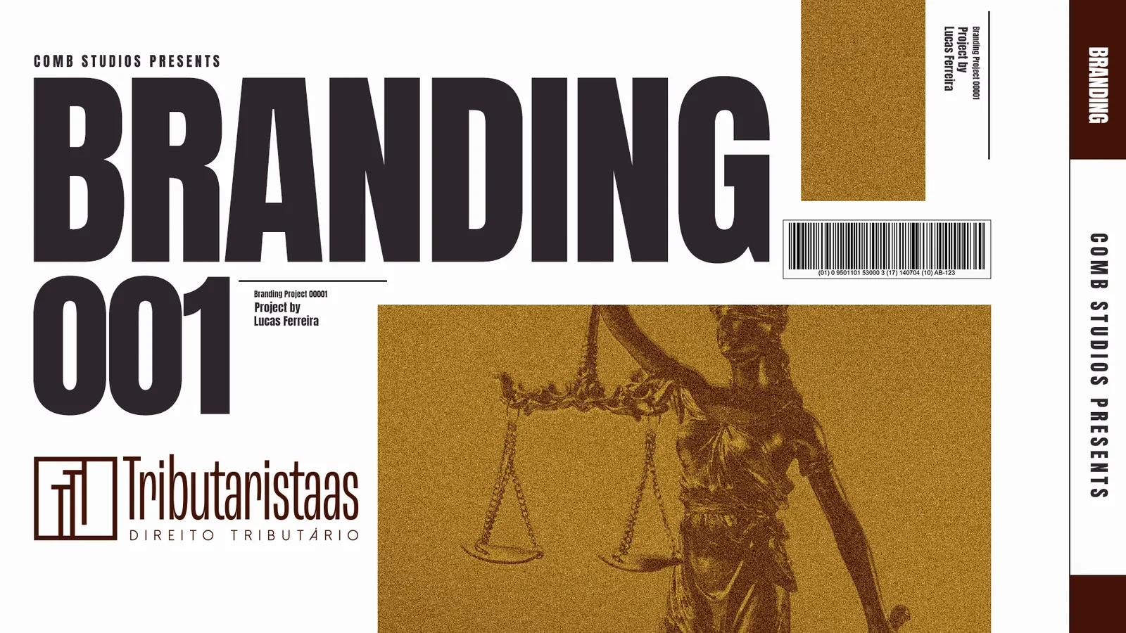
The reference is Art Deco, for the weight it carries in the corporate world: geometry, symmetry, noble materials and ornamental details that speak of luxury, tradition and modernity at once. The project rebuilds the style's simple, sophisticated forms for a brand that wants to be known for elegance and, in equal measure, for the firmness with which it treats its clients.

Symbol
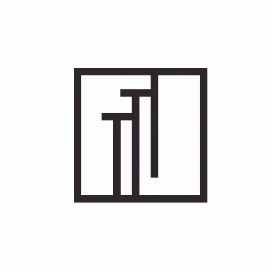
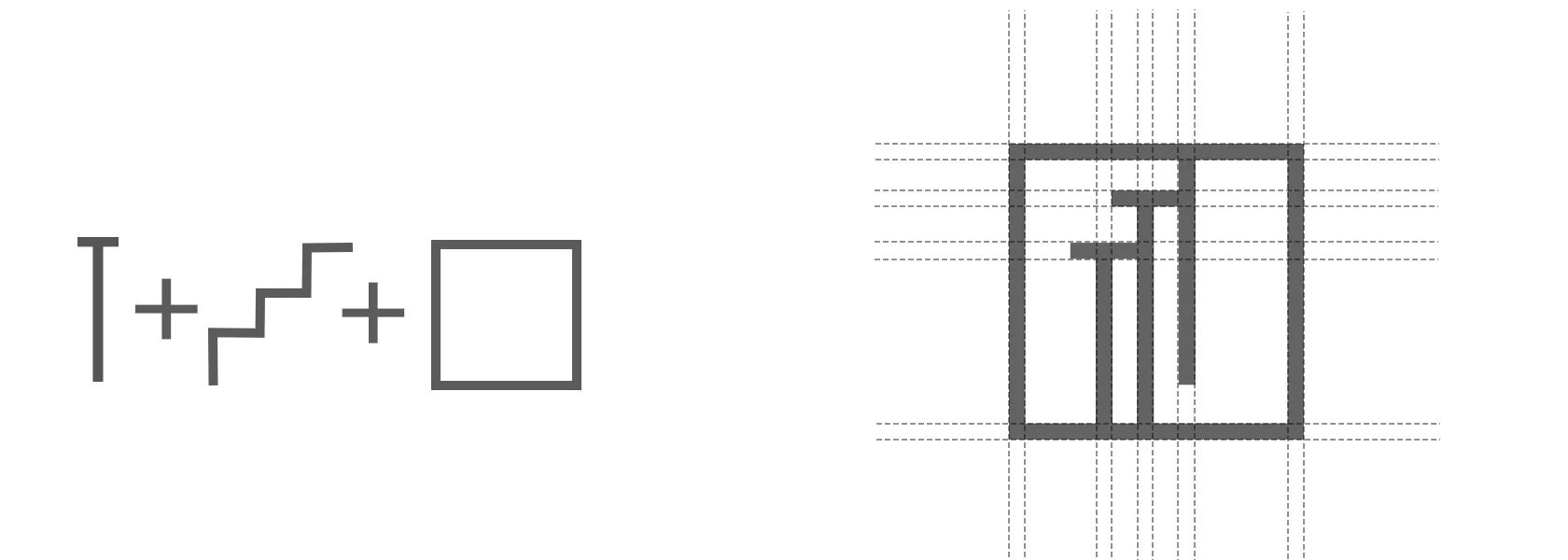
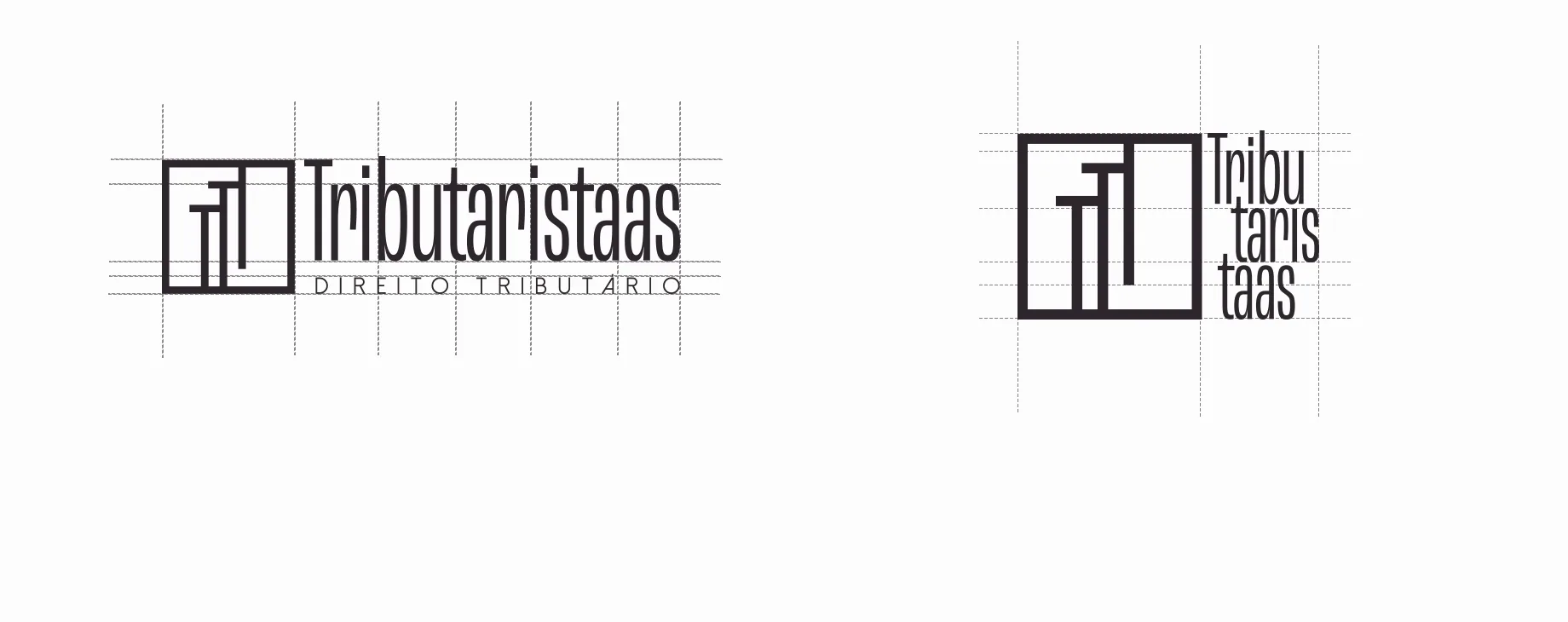
The symbol joins three elements from the brief. The T, the name's main letter, appears three times and is the focal point. The stairs stand for the drive to raise careers and results, through knowledge or through the services offered. The square comes from Art Deco: a concrete, straight-lined form that holds the elements together and expresses a vision.
Typography and logotype
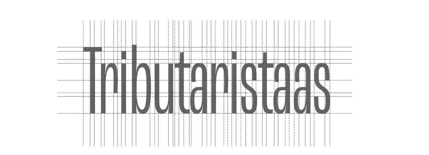
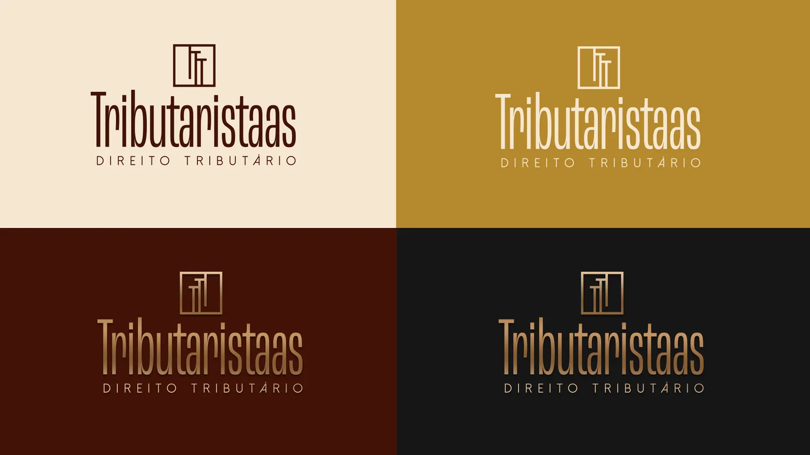
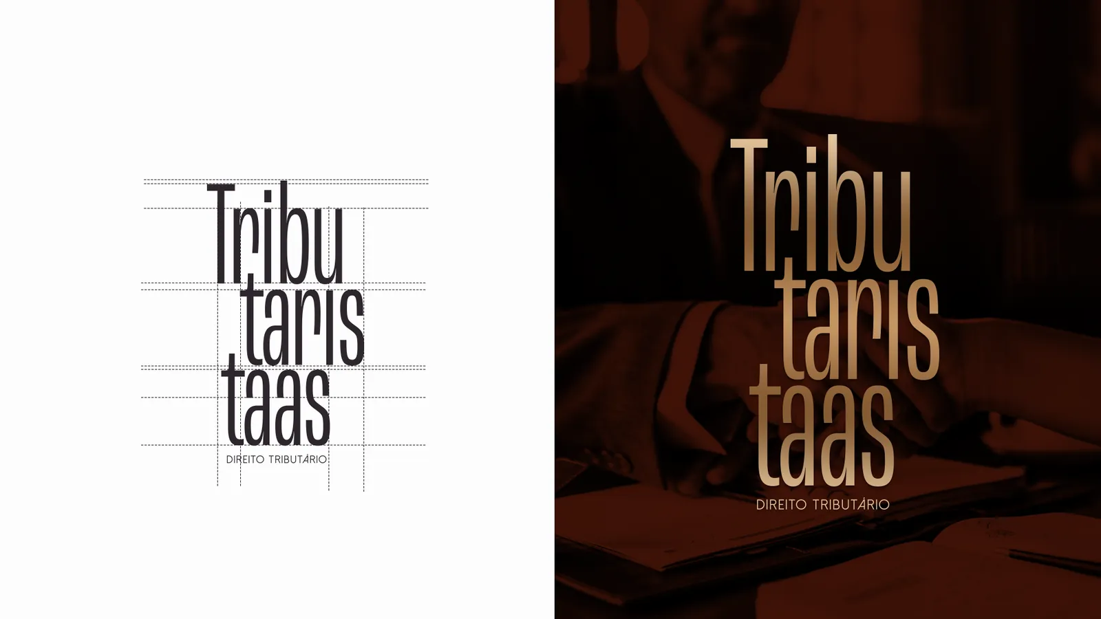
The name is set in a modern condensed sans serif, chosen to express the brand's femininity without pushing male clients away: clean, objective, stable, good on screens. The subtitle, in a face with fixed stems and well-defined shapes, completes the information without stealing focus from the name. The typographic logotype relies on the letterforms alone and comes in horizontal and stacked versions.
Palette
- Marrom #421307
- Creme #F6E7D0
- Mostarda #B5882D
- Cinza escuro #161616
Colors
Colors that talk to Art Deco's elegant retro side while still reading as modern and assertive. Dark brown brings stability, safety and trust; cream, calm and simplicity; mustard, a warm yellow of optimism and prosperity; dark grey, neutrality and balance. Together or apart, they project confidence and professionalism without giving up class.
Applications
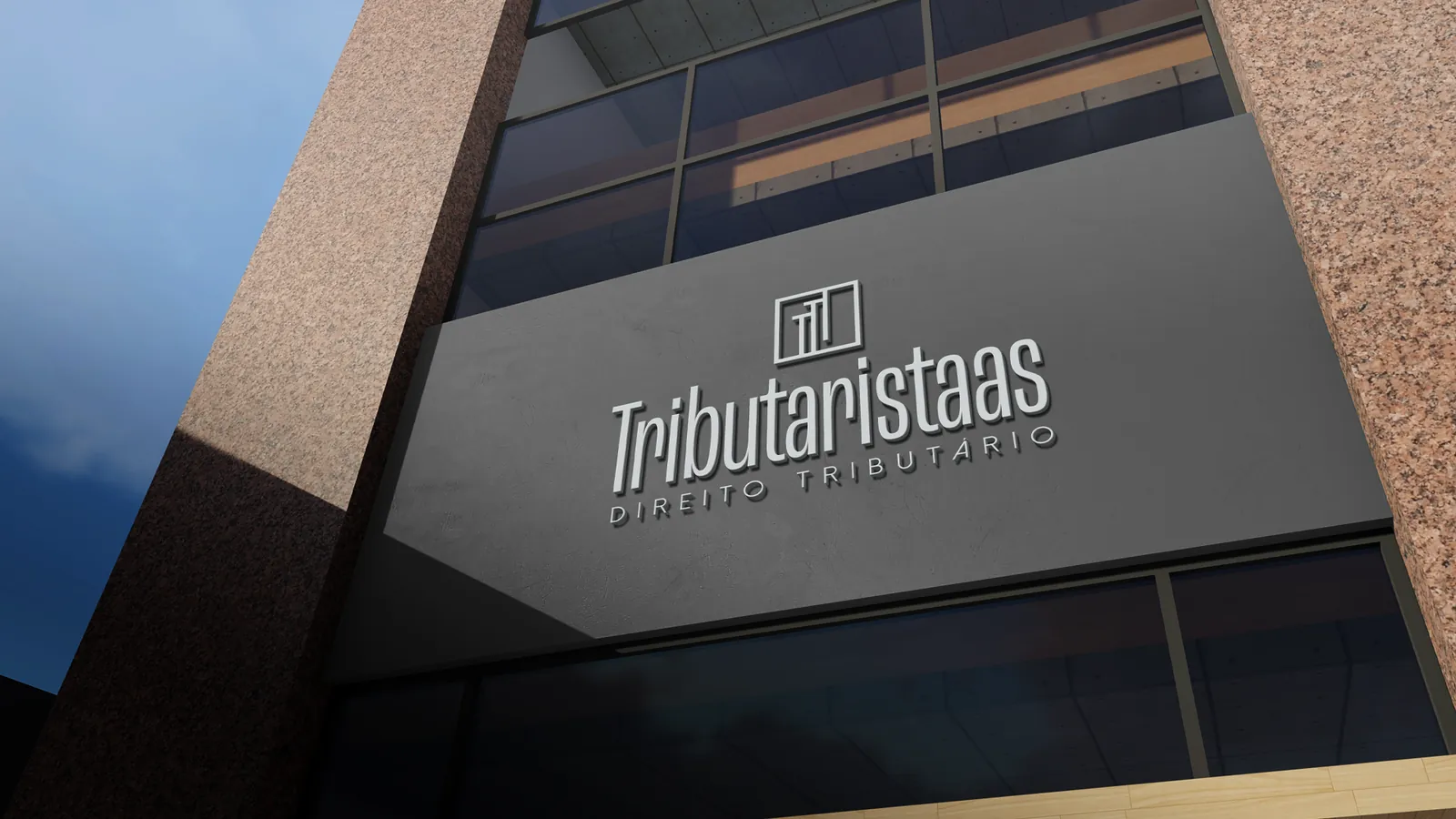
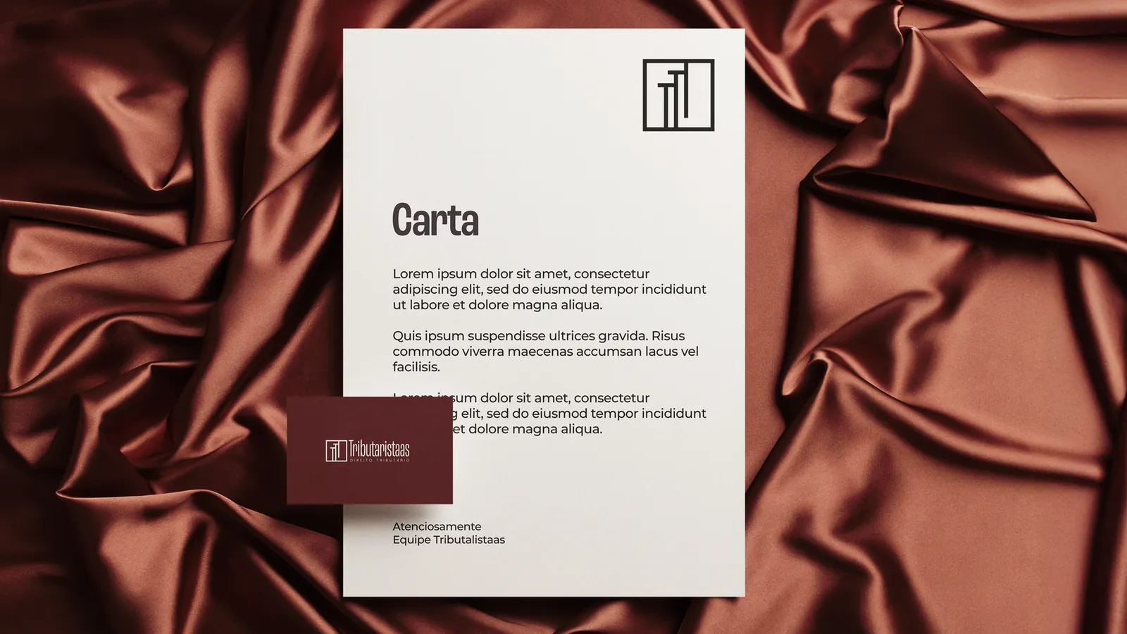
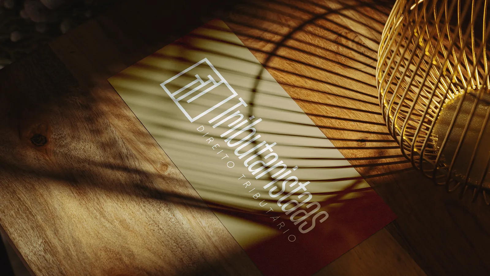
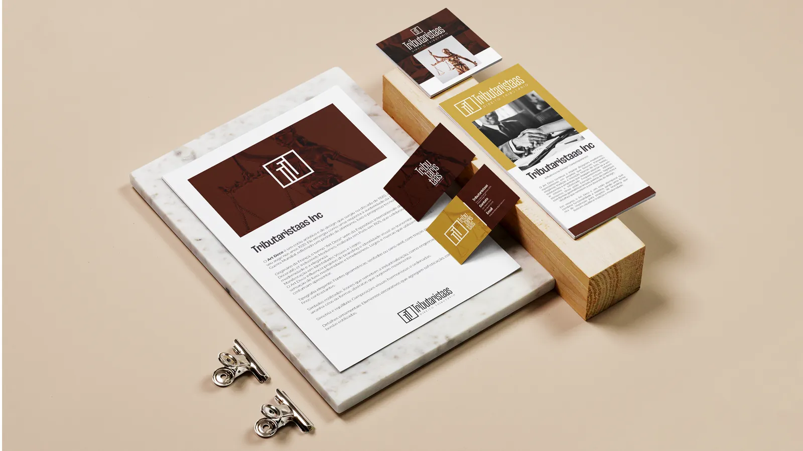
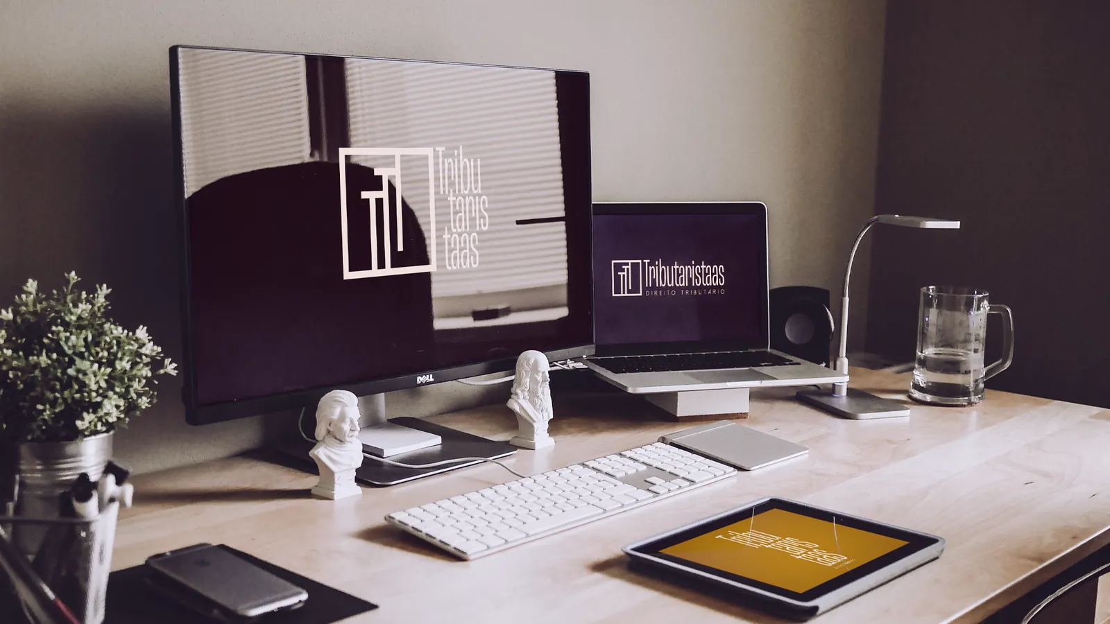
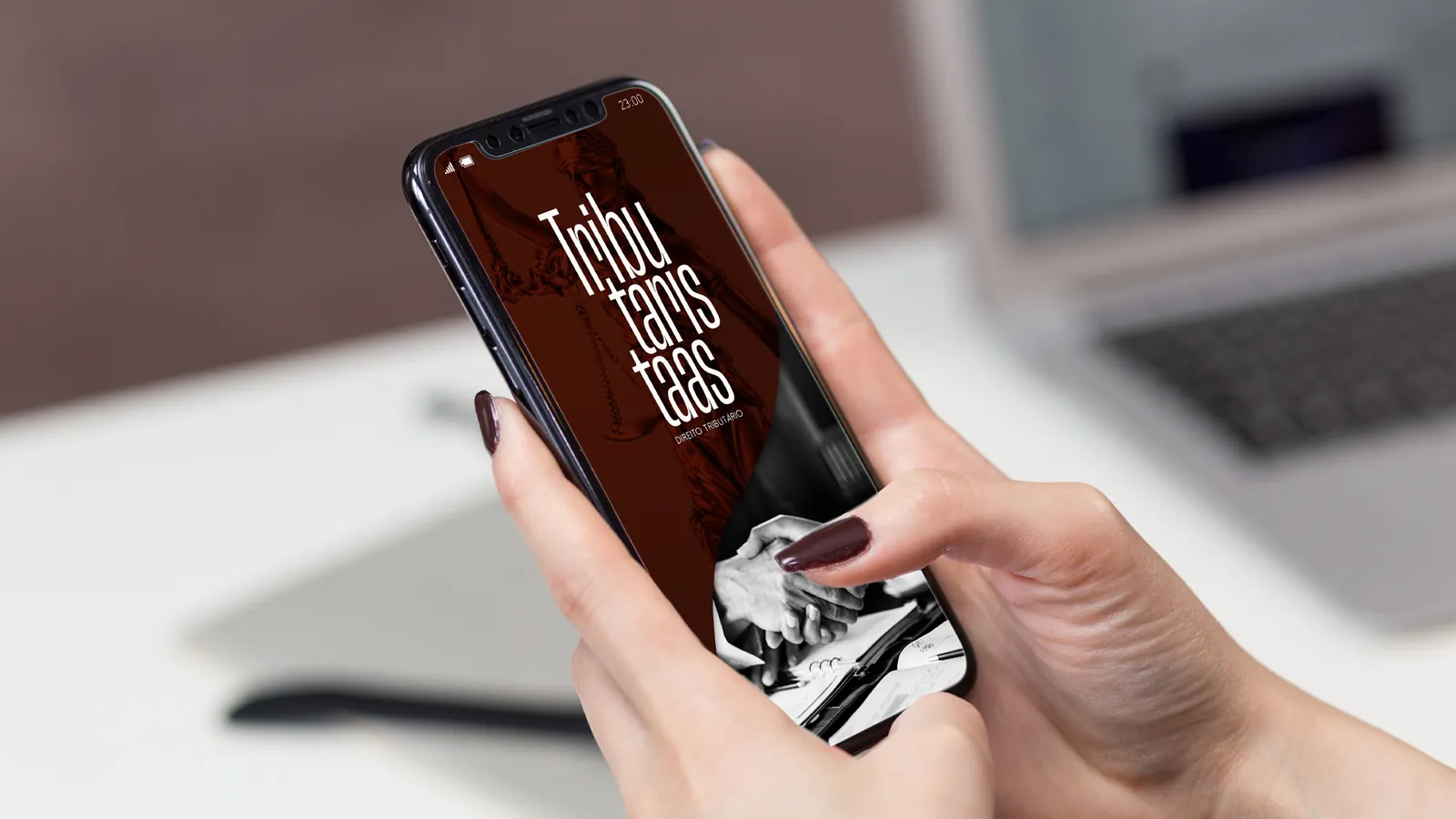
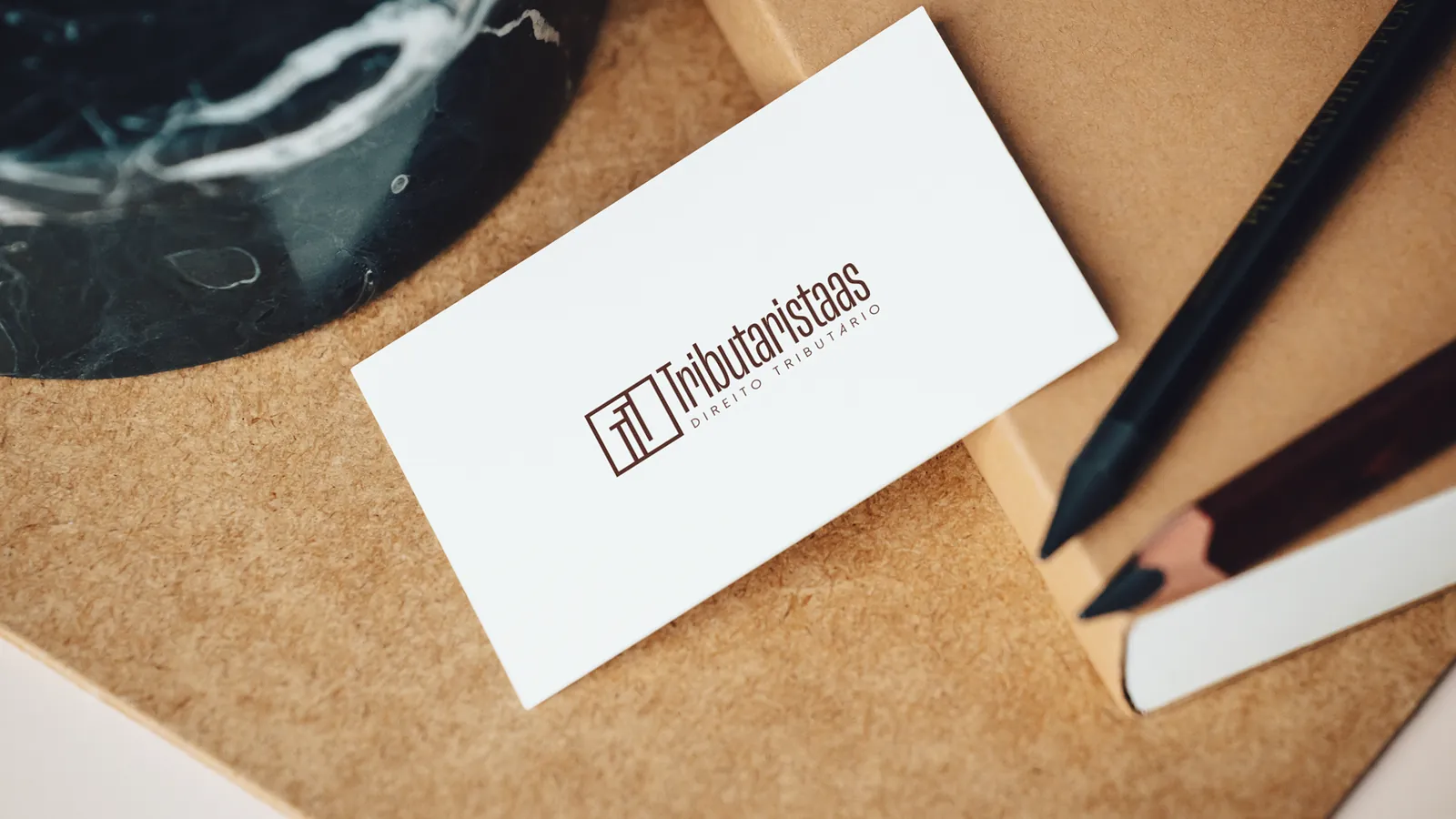
Signage, letterhead, stationery, screens and business card: the brand applied across a law office's touchpoints, always with the same weight.
Let's talk
Tell me what you need and I'll come back with a plan and a quote.